Monochrome coloring is the practice of completing a design with a single colour rather than a palette. Instead of deciding which of forty pencils belongs in each shape, you make one decision once — pick a colour — and then spend the rest of the page working that colour at different strengths.
It is having a moment in adult coloring, and it is also one of the oldest ideas in drawing. Both things are true, and the confusion between them is why people who try it sometimes end up with a page that looks flat. This guide covers what the term means, how to get depth out of one pen, what to colour with, and what the research does — and does not — actually say about why it calms people down.
Two things people mean by “monochrome coloring”
The word gets used for two related but distinct practices. Knowing which one a book is built for saves a lot of frustration.
1. The one-pen format
The newer meaning, and the one most current monochrome coloring books are built around. The design uses large, bold shapes; you fill them with one pen, usually black; the appeal is that there are no decisions left to make. The finished page reads as high-contrast graphic art — solid dark against bare paper.
2. The monochromatic value study
The older, art-school meaning. A monochromatic scheme uses a single hue across a range of values: tints (the hue lightened), shades (the hue darkened) and tones (the hue muted). Painters have used it for centuries to study form without the distraction of colour. Applied to a coloring page, it means one pencil worked from barely-there to full pressure across the same design.
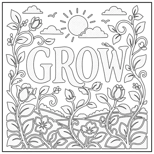
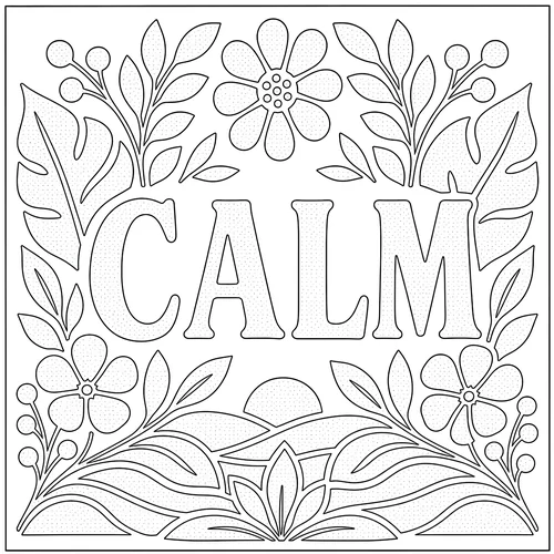
The best monochrome pages let you do either. The pages further down this guide carry a printed stipple layer that marks where the shadows fall — fill it solid and you get the graphic look, work it in values and you get the study.
What it actually looks like
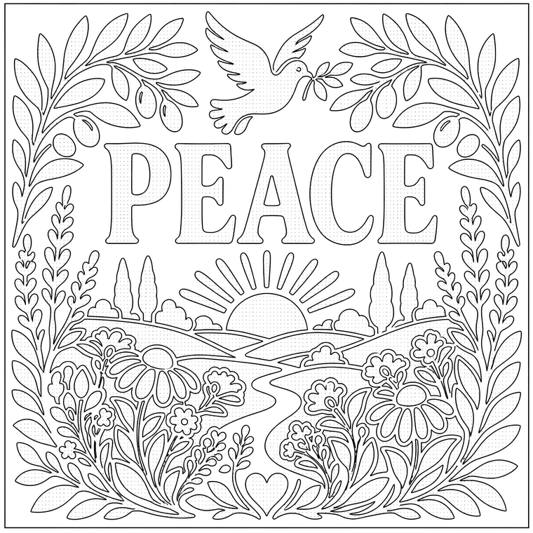
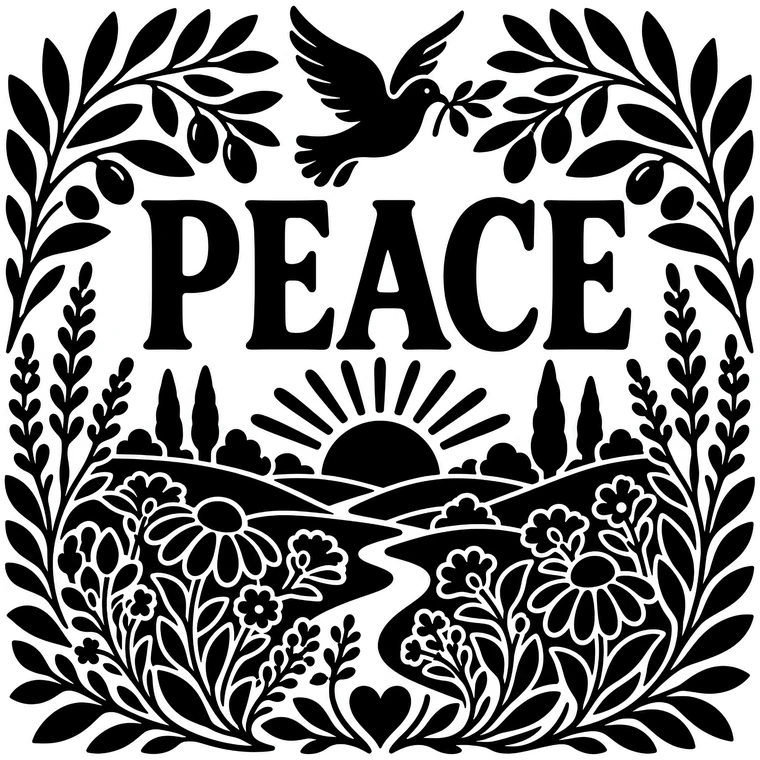
Here is the same design as printed and as finished, using one colour and nothing else. The stippled areas in the left-hand image are the map: they tell you where the dark belongs.
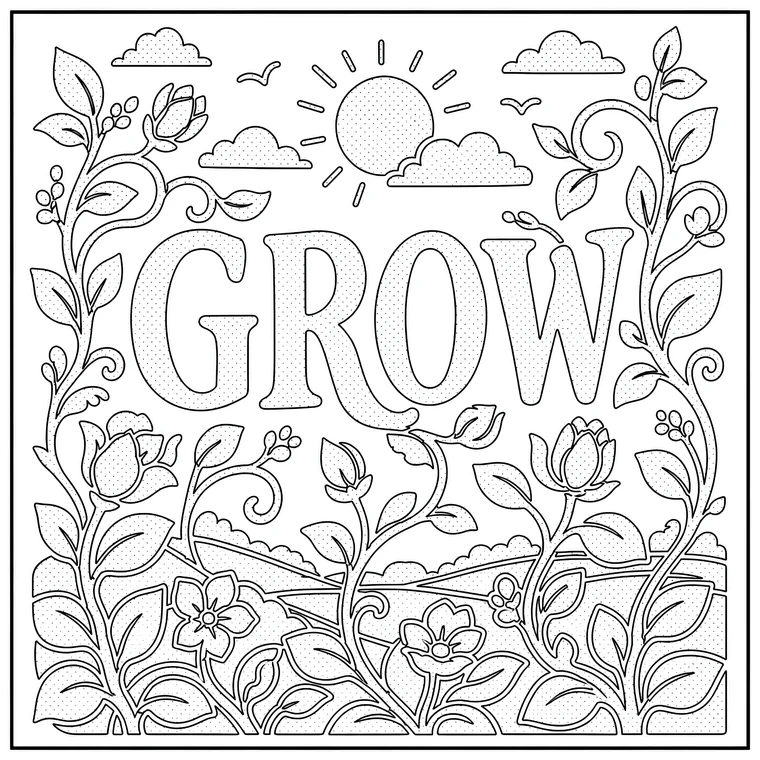 Printed page
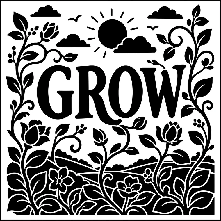 Finished in one colour
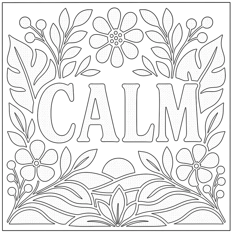 Printed page
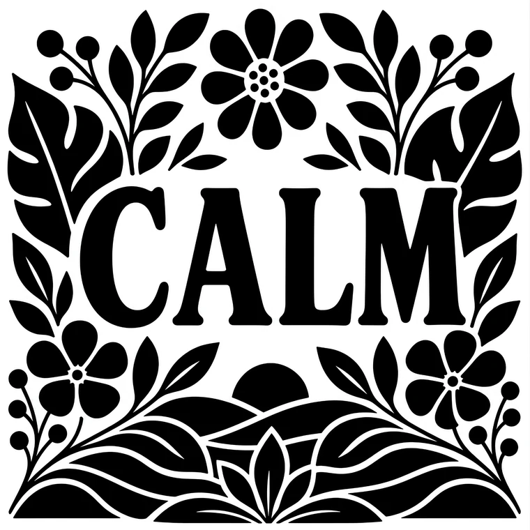 Finished in one colour
The three-value method
This is the part most guides skip, and it is the difference between a page that looks considered and a page that looks like it was coloured in with a marker. With one colour you have exactly one variable: how much of it you put down. Use it deliberately at three levels.
Bare paper — the highlight
Decide before you start which areas stay untouched. This is the most common beginner mistake: filling everything, which leaves the page with nothing to push against. White space is a value, and it is the only one you cannot add back later.
Light pressure — the mid-tone
The largest area of the page. With a pencil this is a light, even layer; with a brush pen it is hatching or stipple that lets paper show between the marks. Do the whole mid-tone pass before you touch the darks.
Full pressure — the shadow
Solid, saturated, no paper showing. Keep it to roughly a fifth of the page. Put it where shapes overlap, under edges, and behind whatever you want to come forward. This is the pass that creates depth.
Work light to dark, always. You can darken a mid-tone; you cannot lighten a solid fill. If you are unsure whether an area should be shadow, leave it mid-tone and come back at the end when the whole page is there to judge against.
The inversion trick
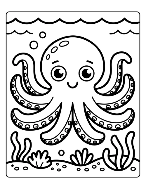
On simple, bold designs, try filling the background solid and leaving the subject bare. A white shell against a field of solid ink reads far stronger than an inked shell on white paper, and it costs nothing to try — print the page twice and do one each way.
 Printed page
 Finished in one colour
What to colour with
Brush pens
The default choice. A 3–6 mm flexible tip fills a large shape in a few strokes and gives you thick and thin from one tool. Look for archival or pigment ink if you want the page to survive being framed. Our brush pen guide covers specific sets.
Graphite pencils
The most forgiving option and the cheapest way to get a genuine range of values. A 4B or 6B gives you everything from a whisper to near-black on the same page, controlled entirely by pressure. If you have never tried monochrome before, start here rather than with a pen — graphite is erasable, ink is not.
Fineliners
Too thin for filling large areas, but essential for stipple, hatching and clean edges. A 0.5 mm alongside a brush pen covers almost everything.
Coloured pencils and markers
Both work. With pencils, use one colour and lean on pressure — the technique in our blending guide applies directly. With alcohol markers, a single colour family in three tones (light, mid, dark) is the closest equivalent, though that is arguably three colours rather than one.
The paper question
Monochrome pages involve large solid fills, which is precisely where bleed-through appears. Standard 80 gsm printer paper is fine for pencil and will struggle with a brush pen. Use 120 gsm or heavier, print single-sided, or slip a scrap sheet underneath. See the paper guide for specifics.
Why it calms people down
Three pieces of research get cited in this area. They are worth stating precisely, because at least one of them is routinely misreported.
Art-making lowers cortisol — for most people
Kaimal, Ray and Muniz (2016) measured salivary cortisol in 39 adults before and after 45 minutes of open art making. Cortisol fell significantly, and — the finding that matters here — prior artistic experience made no difference to the result.
A correction worth making: this study is frequently summarised as “a 75% drop in cortisol”. That is not what it found. 75% of participants showed lowered cortisol; the size of the drop varied between them. The distinction matters, because the real finding is arguably the more useful one: it worked for three quarters of people regardless of whether they considered themselves artistic.
Decision-making is a finite resource
Research on ego depletion (Vohs and colleagues, 2008) found that making repeated choices — even trivial ones — measurably degrades self-control on later tasks. By evening, most adults have spent that budget. A format that removes every colour decision is not a gimmick; it is the one demand a depleted brain can still meet.
Flow needs the right level of difficulty
Csikszentmihalyi's work on flow describes absorption arriving when a task is engaging enough to crowd out rumination but not so demanding that it creates new tension. Intricate mandala work can tip past that line when you are tired. Filling large shapes with one pen usually sits inside it.
Worth being honest about the limits: none of this research studied monochrome coloring specifically. It studied art-making, decision fatigue and flow. The case for monochrome is that it sits neatly where those three findings overlap — not that it has been tested on its own.
Where the idea comes from
Single-colour image-making is not new. Japanese sumi-e — ink wash painting — has worked in black ink alone for centuries, treating the range from wet black to dry grey as a complete expressive range. The Zen practice of ensō, drawing one circle in one breath, takes the same constraint further still.
Closer to the page in front of you is notan, the Japanese design principle of arranging light and dark masses in balance. Notan studies are done in flat black on white, no gradients — which is exactly the problem a bold monochrome page sets you.
The modern adult coloring boom began around 2013, and was dominated for a decade by intricate mandala and pattern work. Monochrome books emerged in the 2020s as a deliberate reaction to that intricacy.
Who it suits
A good fit if…
- You start coloring books and abandon them at the palette stage.
- Evening is when you colour, and detail work has started to feel like effort.
- Your hands are less steady than they were, or fine detail strains your eyes.
- You want the activity, not an artefact to frame.
- You are drawn to graphic, high-contrast imagery.
Probably not if…
- Choosing colours is the part you actually enjoy.
- You want a realistic, full-colour finished piece.
- You like long, absorbing, highly detailed sessions.
- You are colouring with young children, who usually want colour.
How to start tonight
- Print two copies of one page. One to work in values, one to fill solid. You will know within ten minutes which version you prefer.
- Choose your colour before you sit down. That is the only decision the format asks of you. Make it in advance and the page stays decision-free.
- Mark your highlights first. Glance over the page and note what stays bare. Thirty seconds of planning is the difference between depth and mud.
- Do a full mid-tone pass before any shadow. Resist going dark early.
- Stop before you think you are finished. Monochrome pages are almost always over-filled rather than under-filled.
Try it on a real page
Ninety-five free printable monochrome pages — 25 pre-shaded word designs and 70 bold summer scenes. Take them one at a time, or download the whole book as a single PDF.
Common problems and how to fix them
The page looks flat
Almost always too little contrast. You have a mid-tone and a slightly darker mid-tone, but no true black and no bare paper. Push the darkest fifth all the way to solid and erase or leave the highlights — the flatness usually resolves in one pass.
It looks muddy
Too much mid-tone across too much of the page. Aim for roughly one fifth bare, three fifths mid, one fifth solid, and the page will read.
The ink bled through
Paper too thin for the fill. Move to 120 gsm or heavier and print single-sided.
My brush pen streaks on large areas
Work in one direction while the ink is still wet and do not go back over a drying edge. On very large shapes, a chisel-tip marker lays down flatter than a brush tip.
The first page felt strange
Expected. You will keep reaching for a colour that is not there. It generally settles by the third page.
Frequently asked questions
What is monochrome coloring?
Monochrome coloring is filling a printed design using a single colour instead of a palette. Depth comes from varying that one colour — pressing harder for shadows, lighter for mid-tones, leaving paper bare for highlights — rather than from choosing different hues.
What is a monochrome coloring book?
A book of designs drawn to be completed in one colour. The artwork tends to use larger, bolder shapes than a mandala book, and many titles print the shading in as stipple or hatching so you can see where the dark belongs before you start.
What are the best markers for monochrome coloring books?
A black brush pen with a 3–6 mm tip is the standard choice — it fills large shapes in a few strokes and the flexible tip gives you thick and thin in one tool. Pair it with a 0.5 mm fineliner for stipple and edges. If you would rather have a full range of values from a single tool, a soft graphite pencil (4B–6B) is cheaper and more forgiving.
Do monochrome coloring pages have to be black?
No. Any single hue works. Black gives the strongest contrast, but indigo, sepia, deep green and burgundy all read well. The rule is one hue at several strengths — not black specifically.
Is monochrome coloring easier than normal coloring?
It is easier to start and harder to master. There are no palette decisions, so beginning is effortless. Getting a page to look deliberate rather than flat takes some control over pressure — which is the actual skill the format teaches.
How do I make my own monochrome coloring book?
Take line art with large open shapes, print it single-sided on paper of at least 120 gsm, and add a stipple layer where you want the shadows to fall. The stipple is what turns ordinary line art into a monochrome page: it tells the colorist where the dark belongs.
Where can I download a free monochrome coloring book PDF?
You can download a free printable monochrome coloring book here — 95 pages with a cover, as a single PDF, with no account or payment required.
Sources
- Kaimal, G., Ray, K., & Muniz, J. (2016). Reduction of Cortisol Levels and Participants' Responses Following Art Making. Art Therapy, 33(2).
- Vohs, K. D., et al. (2008). Making Choices Impairs Subsequent Self-Control. Journal of Personality and Social Psychology, 94(5).
- Csikszentmihalyi, M. (1990). Flow: The Psychology of Optimal Experience.
- Stuckey, H. L., & Nobel, J. (2010). The Connection Between Art, Healing, and Public Health. American Journal of Public Health, 100(2).